Straddling Worlds
The lithographic production of Ravi Varma merged the world of painting with print and a European approach to art with deeply Indian themes.
by Koeli Mukherjee Ghose
T Madhava Rao, once a Dewan of Travancore, had the opportunity to follow the initial stages of the artistic career of the young Ravi Varma. Known to be his mentor, he wrote to the artist in 1884 while he was staying at Baroda as the Resident for the Raj Government and Regent of the Crown Prince: “There are many of my friends who are desirous of possessing your works. 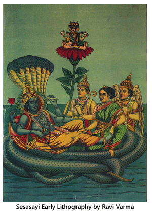 It would be hardly possible for you, with only a pair of hands to meet such a large demand. Send, therefore, a few of your select works, for you will hereby not only extend your reputation, but will be doing a real service to the country."
Ravi Varma did act upon this suggestion. With the exception of those paintings done for The Maharaja of Baroda, who had permitted him to exhibit only 14 of those paintings in public, Varma made an exhibition that was showcased in Trivandrum, Mumbai and the Durbar Hall of the Royal Palace. The first public exposition of his mythological paintings was a great success, and Ravi Varma was convinced of the necessity for his works to reach a larger viewership. He very much wanted to avoid the confinement of his paintings within the Royal Palace. He decided to create prints of his works in 1891.
The Ravi Varma Press was founded in 1892. Mumbai was chosen as the best possible location for two reasons: the port (all the machineries for the press came from Germany, and they were large in dimension), and the availability of local labour. These labourers were supervised by European master printmakers from Berlin.
The oleograph and lithographic production of Ravi Varma has been divided into four categories by Eurico Castelli and Giovanni Aprilli from Italy who presented a researched exhibition of the lithographs within an inter-university agreement between the Pune and Perugia Universities (as part of the Program of Scientific and Technologic Co-operation between Italy and India during 2005 -2007). Castelli and Aprilli categorized the works as devotional, mythological, historical and feminine. They compared their own database of the list of entries of prints with that of the one published earlier in 1993 to analyze the entire Ravi Varma production, “For a better understanding of his role in the history of modern visual arts in India”. Castelli and Aprilli also mention that, “By comparing the percentages between the list of the 89 drawings quoted above and the 134 entries we recorded, we came across some information on the early market response to Ravi Varma lithographic production. Unfortunately, we never had any information on the number of each of the subjects. This would have provided an exhaustive answer on their distribution in India." Nonetheless, the numbers of subjects per category shows the preferences of the public through the eyes of the printers at least:
"The percentage (30%) of devotional prints (distinguished by the choice of a divinity painted in the middle of the lithograph and whose eyes look back at the viewers) remains unchanged; there is an increase, (from 36% to 47%) of mythological subjects; the percentage of historical prints, including the figures of saints and of national heroes as well, remains marginal (with an increase from 4% to 7%). The only subjects that show a remarkable decrease were the feminine ones (from 29% to 17%). The results confirm that devotional and mythological subjects were strongly appreciated. The percentages never show the number of copies produced for each subject nor the replicas on different formats as it was the case for the publicity production that transformed the mythological images into icons of modernity.”
Although Varma's treatment of the medium of oil painting in being descriptive of the material painted emerged from his understanding of the western masters,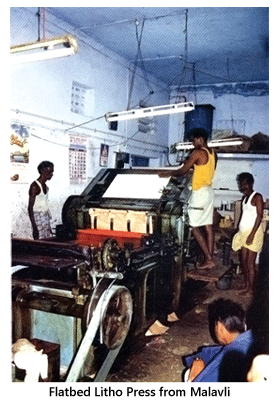 Ravi Varma's careful selection of the mythological sequences for his paintings reflects his awareness of his elemental cultural inheritance and a sense of connectedness with India. Because of the shared narratives, he was conscious of the power of the lithographic medium, and consequentially it was effective for his selection of imagery, keeping in mind the image and viewer relationship. On the other hand the adornments carefully reproduced in his oleographs became a point of reference for ceremonies, clothing and jewellery all over India. Criticism for his work often emphasizes the fact that he was just imitating western artists, while in fact he felt it was a necessity to describe precisely the essence of his time.
In the dissemination of lithographs in India the Ravi Varma press played a very important role. They specialized in the reproduction of oil paintings through oleographs and lithography. The Ravi Varma brothers called in specialized German workers knowing the technique of lithography to create multiples of Varma's paintings. Looking at the original oil paintings and lithographs clarifies some remarkable differences. The lithographs were much smaller in scale and less effective in comparison to the paintings, but Ravi Varma, being conscious of the impact of the paintings in oil, kept adding dramatic elements to the lithographs and reinforcing in them the message, as he would in his paintings. The lithographs needed more details around the main figure, as this added depth. In oil painting the same effect was obtained by using a certain measure of dark colour. In the original painting of Radha Madhava, the figures are set in the moonlight, while for the lithographic process it was necessary to transform it into daylight…changing the emotional impact of the subject matter to some extent.
The process of printing at the Ravi Varma press involved a step by step approach. Firstly the oil painting that was to be reproduced was copied by the artist on a layout of suitable size for printing.  A master stone was then prepared, after which a chief graphic designer would draw the lines that bordered all the coloured areas on the transferred image that was already sketched. Each stone was ascribed a particular colour and had a single person drawing on it either with a pen, a brush or a pencil. The stones were then checked, and after the corrections were made, a progressive proof was obtained. This was an important account of the work to be kept in order to recreate a stone in case it was damaged during printing. In order to make possible the replication of each drawing, an extra print of the stone was taken with black ink. The last print of the progressive proof, with all the colours, was prepared for press copy. Fresh prints were always evaluated against it so that the quality was not hampered due to the wearing of one of the matrixes. The prototype was always compared to the printed sheet, and the press workers were encouraged to match the quality of this press copy to create perfection.
Differing from the earlier production, the press copies from the Ravi Varma press are easily identified by the presence of registration marks in the middle of the image. A careful examination of the progressive proofs lends an insight into some of the stylistic choices made to have the best results. The first colours were flesh tint, yellow, and pale blue. These were rendered with large brush strokes, and details were drawn with pen in black and dark colours. The chiaroscuro was created with pencil. Colours were printed from light to strong and then the dark tones. It is noticeable in the progressive proofs that less than a dozen colours were used and that the focus was to obtain the desired gradation by intermixing them, and interestingly, the sequence of colours could be traced in the side band. One comes across a black layer of thin pen lines in between the colour sequences. This added a graphic quality and sharpness to the lithographs, but in the early lithographs from the Ravi Varma Press, subtle shadows were gained with blue, and black was used only for drawing contours and hair.
To illuminate the print the last impression was made by the colour gold. The process was expensive and difficult, and gradually the illumination was stopped. The print was finished and protected by a last coat of varnish. Finally, framers and craftsmen often decorated the prints with glitter and sequins and small stitched pieces of cloth.
Brief Chronology:
1892: The Ravi Varma brothers start reproduction of their paintings with the expertise of printers at Ghatkoper in Bombay.1892-94: The Varma brothers build their own press in collaboration with the industrialist Govardhan Das Khatu, at Girganam in Bombay. Four technicians from Germany are appointed for its operation.
1895: Varma is awarded "Best Work" by the Bombay Art Society for his lithograph, The Birth of Shakuntala.
1898: The Ravi Varma Press shifts to Malavli in Bombay.
1901: The Ravi Varma Press is sells to Fritz Schleicher, one of the four German technicians who had worked since the inception of the press. The Varma brothers hand over to him the right for reproduction. Ravi Varma continues his co-operation with the Ravi Varma Press till he passes away.
Tags: art


